Build an AI website in 60 seconds
AI generates your personalized website instantly with built-in scheduling, payments, email marketing, and more.
Start for free


One-page website examples (2026)


A one-page website presents everything visitors need in a single, clean flow: who you are, what you offer, and how to get in touch. It’s similar to a digital elevator pitch – it’s short, simple, and straightforward, yet powerful.
This guide explores why one-page websites still work (even in a world full of complex sites), walks through 15 real examples that prove simplicity sells, and shares why they work so you can design your own.
Best one-page website examples (and why they work)
A one-page website proves that you don’t need dozens of tabs to make an impact. Instead, a simple layout with a well-crafted story told from top to bottom can do the trick.
The examples below show how different brands, freelancers, and creators use a single-scroll page and why they’re effective.
1. Startup launch page
Furry Nomad's single-page website features a clean hero, simple but engaging product visuals, and a clear CTA: “Get Early Access.”
Why it works: This one-pager presents a clear and immediate focus on the offer with no distractions.
2. Freelancer portfolio (designer / developer)

Chungi Yoo’s website has smooth scroll sections for About, Work, and Contact, perfect for both desktop and mobile users.
Why it works: The website combines a minimalist, dynamic design and parallax scrolling layout with simple storytelling and a contact-first layout.
3. Restaurant or café page
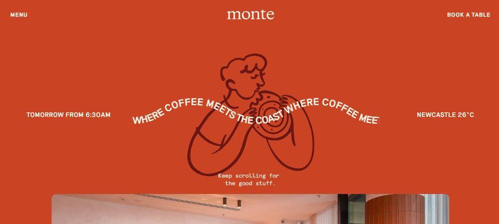
Australian restaurant Monte showcases a one-pager complete with hero image, menu highlights, map link integration, and reservation CTA.
Why it works: This website design provides all the key info in one scroll, giving clients a frictionless experience.
4. Event or conference page
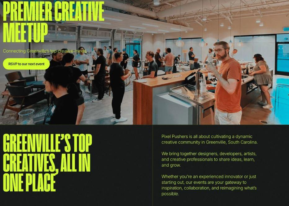
Pixel Pushers’ one-page event announcement uses a visually stacked layout, offering a seamless scrolling experience that includes the agenda, speakers, and ticket details.
Why it works: This type of design layout is ideal for limited-time campaigns.
5. Coaching or consulting service page
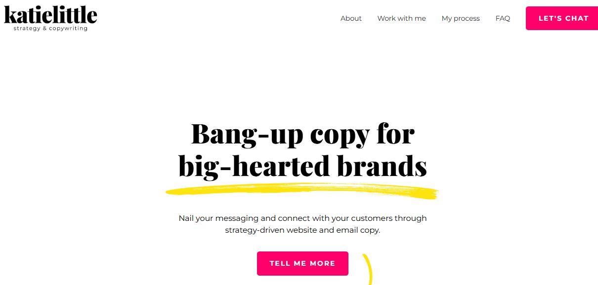
Katie Little’s landing page features benefits, testimonials, and a booking link, providing linear, single-scroll narrative from hero section to CTA.
Why It Works: Scannable text, automatic scrolling design, and thumb-reachable CTAs create a fast path from awareness to conversion.
6. Artist or photographer showcase
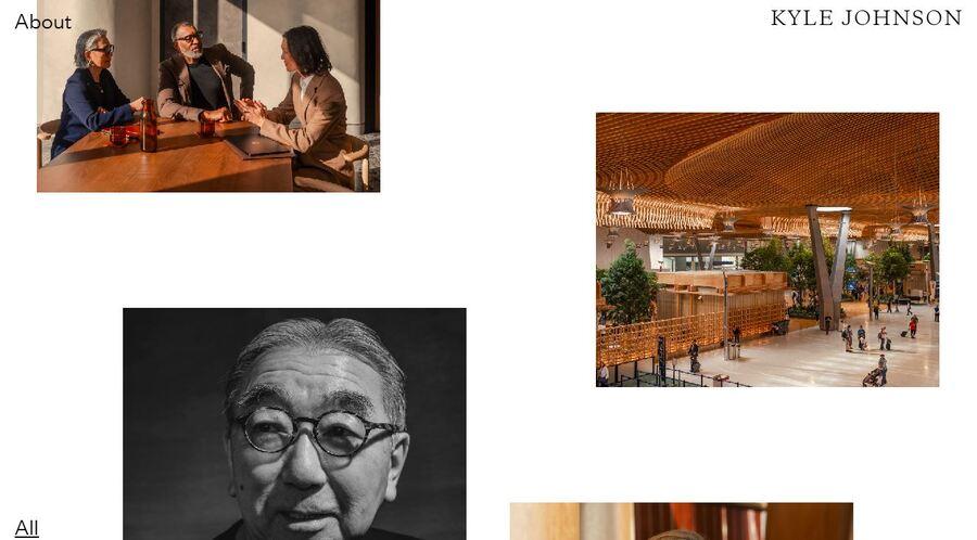
Kyle Johnson’s website has a two column grid-style gallery + short bio displayed in an overlay design.
Why it works: This minimalist, single-page layout features visual storytelling with minimal text.
7. SaaS product overview
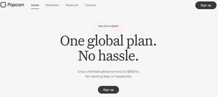
Popcorn’s website features a complete product overview, including pricing, FAQs, and CTAs all on one screen.
Why it works: This simple design layout and bold typography make the experience smooth and reduce friction for sign-ups.
8. Real estate or property listing
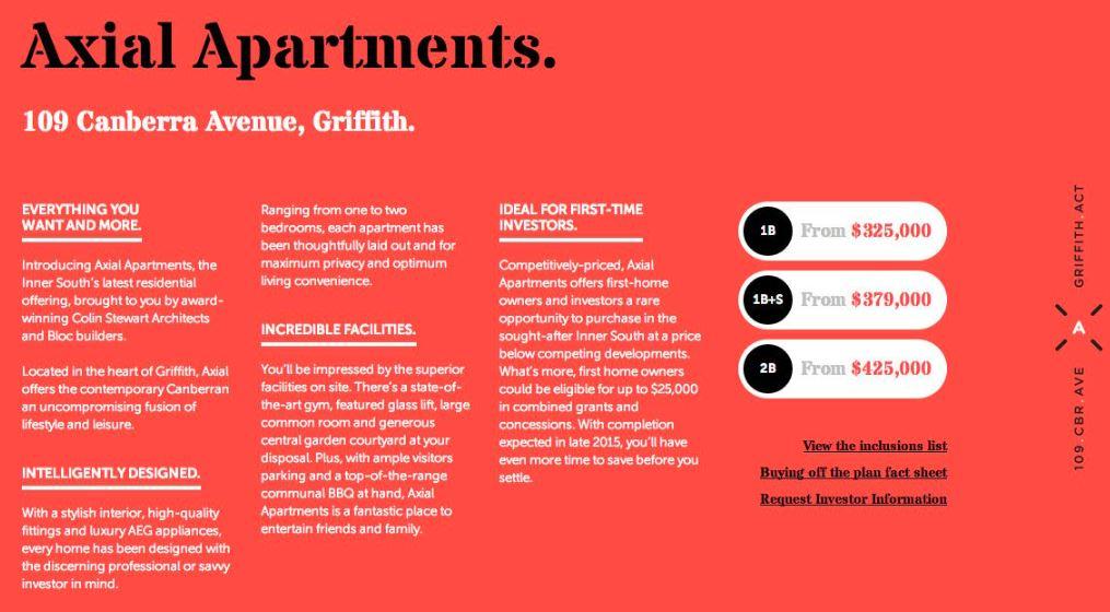
Axial Apartments’ long-scrolling, single-page website presents a captivating hero banner with property details and form for inquiries, creating a seamless experience designed for conversion.
Why it works: This design offers detailed information with an easy-scrolling layout for streamlined lead generation.
9. Agency or studio site
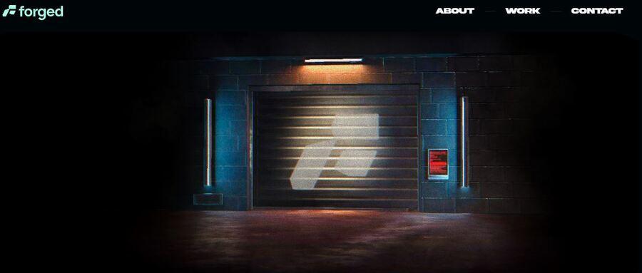
With an interactive design layout with parallax scrolling, Forged features a strong hero tagline service overview, portfolio snapshots, and a contact form.
Why it works: By using this unique layout, Forged communicates credibility quickly to visitors.
10. Fitness instructor page
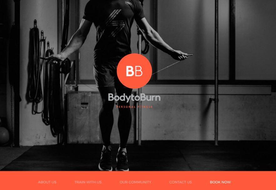
Body to Burn’s single-page website guides visitors to its About page, followed by the different training options and classes, and the contact page for booking.
Why it works: With its simple design, coupled with bold typography and an auto-scrolling layout, this single-pager directs visitors to the next action, which is booking via contacting.
11. Musician or band page
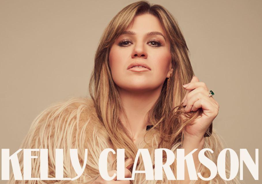
Kelly Clarkson’s long-scrolling one-pager displays a strong hero video of her latest single, “Where Have You Been,” followed by her merch, album carousel, and tour dates.
Why it works: The website’s stacked layout creates an immersive experience with simple storytelling.
12. Wedding or event page
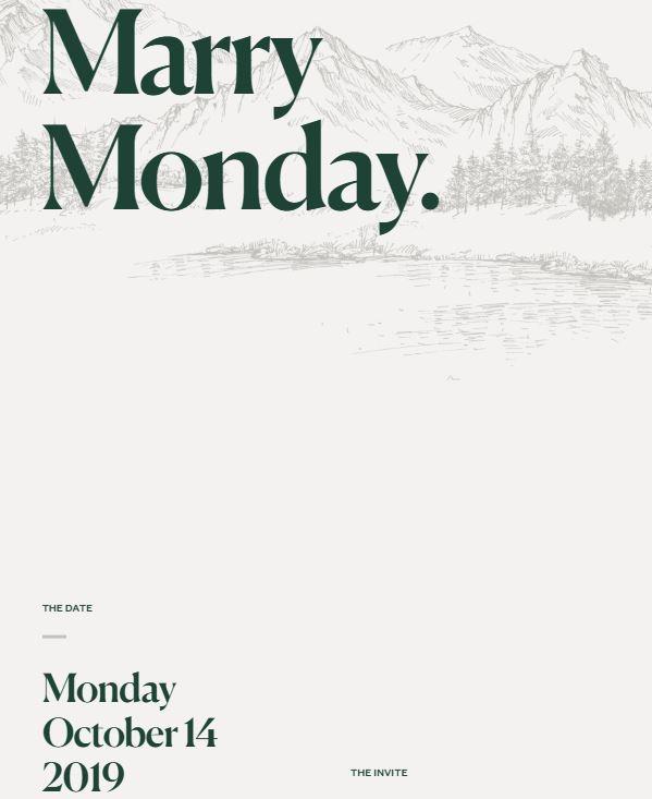
This one-page wedding invite showcases a simple, parallax scrolling layout that features a timeline, an RSVP form for guests, and a gallery showcasing the couple.
Why it works: Despite its minimalistic design, this single-pager creates an emotionally engaging vibe and a clean, well-organized layout.
13. Product landing page
I Am Super Juice’s one-page website uses auto-scrolling layout and focuses heavily on interactive and dynamic visuals that flows seamlessly to the testimonials page and CTA.
Why it works: The site provides visitors with one clear offer, which is also perfect for paid ad traffic.
14. Agency landing page built with AI
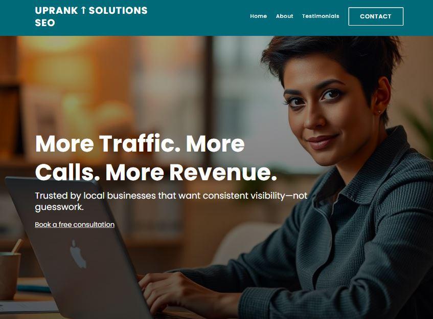
With its clean, AI-generated sections for CTAs, team, and testimonials, UpRank Solution’s parallax scrolling and auto-scrolling layout provides a seamless experience to visitors.
Why it works: BoostLocalSEO’s one-pager uses AI’s layout precision and consistency.
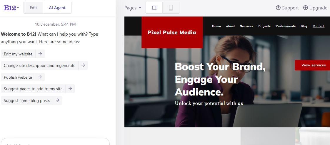
15. B12 one-page website example
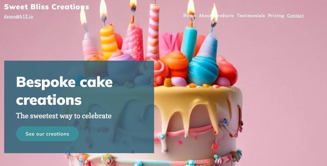
This single-page website features an auto-generated layout with hero, services, contact form, and trust signals.
Why it works: B12’s single-pager combines human design input with AI structure for conversion.
Best practices for designing a high-converting one-page website
Consider using these best practices tips when designing your own one-page website:
1. Define one clear goal
Every great example of a one-page website starts with a single purpose. Whether you want visitors to book a call, buy a product, or sign up for updates, it’s best to decide first on the exact primary action you want visitors to take. Focusing on this goal helps shape your hero section, messaging, and persuasive copy so that everything flows toward that desired outcome.
2. Use logical section flow
The strongest one-page designs usually follow a natural storytelling rhythm. To create a powerful single-page site, consider using this framework:
- A bold hero section that grabs attention
- Product or service benefits
- Social proof (client testimonials and reviews)
- Clear CTA
- Contact section
Arrange each block like a conversation rather than a brochure: introduce, explain, prove, then invite.
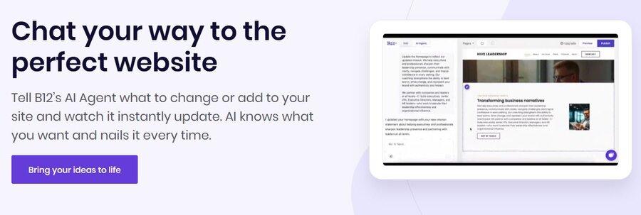
B12’s AI follows this logical structure when creating single-scroll websites. This ensures you have a straightforward layout that makes it easier for your target audience to follow along without having to click through additional pages.
3. Add visual anchors and smooth scroll navigation
Use bold typography, bright colors, and strong visuals to create focal points that break up long scrolls. Pair these designs with smooth-scrolling transitions and generous white space to give the design a dynamic feel.
These layouts can enhance seamless navigation, especially in mobile devices, and turn simple scrolling into an immersive experience.
4. Keep copy concise and impactful
Write short, scannable text in a straightforward manner to make sure your visitors understand your offer in seconds. Use action-oriented phrases like “Get started,” “See plans,” or “Book your spot.”
Use AI-generated text as your starting point to simplify and speed up the writing process. Then you can refine it to match your tone and brand identity.
5. Include conversion triggers
A one-page website works best when it builds trust naturally. Using social proof, such as client testimonials, recognizable logos, or a few success stories, can help establish your credibility.
B12’s AI can auto-generate website testimonials and sign-up blocks. These trust signals help potential clients feel confident enough to click your clear call to action.
6. Optimize for mobile
Single-page websites are ideal for mobile users because of their simple navigation. With this in mind, having a mobile-first design isn’t optional anymore. So, always check how your site appears on smaller screens, including the visual hierarchy and CTA placement.
Make sure the texts are scannable and the scrolling remains smooth. Also, ensure the buttons are within easy reach of visitors’ thumbs to improve accessibility and overall user experience.
How to create a one-page website with AI (using B12)
Here’s a quick and simple step-by-step guide on how to create your single-pager using B12’s AI website builder:
-
Write a short business description (for example: “A yoga instructor offering online classes”).
-
Let the AI build a one-page structure with suggested sections.
-
Refine the copy, images, and CTAs to match your brand personality. You can also use the AI Agent feature to speed up the whole process and keep everything aligned with your goals.
-
After previewing your site, hit publish. Your website will be for mobile users and set up with basic SEO.
B12’s AI ensures your content flows into a straightforward layout (from hero to CTA) and suggests typography and colors that match your brand. This approach reduces the back-and-forth and gets you to testing faster. With this framework, B12 helps you create a one-pager with a clean layout and scannable text that encourages conversions.
Why one-page websites are still trending in 2026
People scroll and skim. They want the essentials fast. That's the benefit of creating your own one-page website.
With a tight, linear narrative, a single-page site reduces friction and keeps attention on the value proposition. A one-pager always has a focused message that's delivered in a straightforward manner. Featuring a hero section, benefits, social proof (client testimonials and reviews), and a clear call to action (CTA), it's the perfect, no-fuss tool for engaging your target audience.
Because one-page sites have less navigation overhead, they often load faster and are more direct on phones compared to a multi-page website. Designers use bold visual anchors, sticky menus, and clear anchor links to smoothly guide visitors to the part of the page that really matters. These approaches support better conversion rates, particularly when the goal is to get visitors to sign up, book an appointment, or buy a product.
One-page websites are ideal for various use cases. Some of the ideal use cases for single-scroll websites include:
- Freelancers & creatives (personal brand): A compact online portfolio that shows work and a direct contact point.
- Product launches or events: A focused product landing page with pricing and an early-access CTA.
- Small service businesses: Contains contact info, testimonials, and a booking flow in one scroll.
AI tools, including B12's site builder, can generate a single-page website with a clean, straightforward layout design for your small business. You only need to provide a short description of your business to create your own one-page website.
You may also check B12’s prompt gallery if you want a ready-made template that aligns with your industry. The platform offers several options to choose from, whether you want to create a single-page website for your portfolio or a small business.
Conclusion
When organized the right way, a one-page website shows that simplicity can have a big impact. Every section, from hero to CTA, works together to give visitors a clear value proposition and guide them toward the desired action.
With B12, you can create a clean, conversion-ready one-pager in just minutes, complete. It also comes complete with a scannable text, high-quality visuals, and a mobile-friendly design.
Whether you’re showcasing a personal story, launching a product, or offering services, this approach keeps everything in a straightforward layout that engages your target audience.
Ready to get started? Build your one-page website with B12’s AI website builder and get ready to launch in minutes.
Look professional online with tips from B12
Receive our email newsletter for advice on how to grow your business and engage clients.
Draft your site in 60 seconds
Get an AI website made specifically for you that's free to launch.
Start for free ✨No credit card required
Related posts


Spend less time on your website and more time growing your business
Let B12 set up your professional online presence with everything you need to attract, win, and serve clients.